
How to add a wishlist heart icon inside the product image on Prestige theme?
👉 Before you continue: This guide assumes you’re already familiar with the Wishlist Power web component. If you haven’t yet, I recommend starting with this article: Wishlist Button Web Component for Shopify.
If you’re using the Prestige theme, you can easily place a heart icon directly inside the product image on the product page by leveraging the <ooo-wl-wishlist-button> web component.
In this article, I’ll show you how to add the icon by editing your theme code.
🎯 Final Result
Here’s what it will look like once implemented:
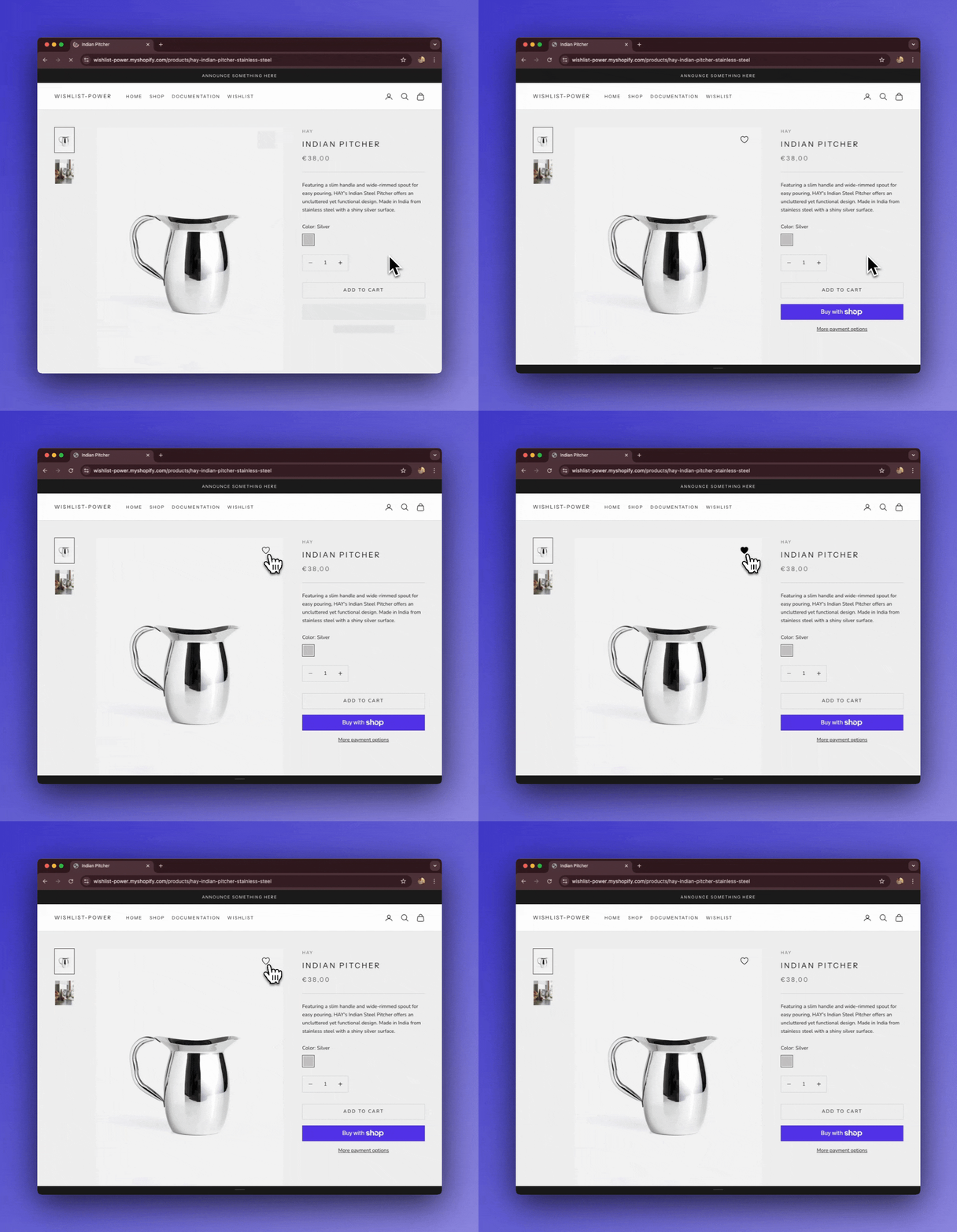
The heart icon appears in the top-right corner of the product image, toggling between “add” and “remove” states.
📝 Step 1 - Open snippets/product-gallery.liquid
- From your Shopify admin, go to Online Store → Themes → Edit code.
- In the code editor, open the file
snippets/product-gallery.liquid
🔧 Step 2 - Insert the Wishlist Button
Inside the element, paste the following code right on top of the div that has the product-gallery__image-list class:
...
<product-gallery class="product-gallery" form="{{ product_form_id }}" {% if enable_media_autoplay %}autoplay-media{%
  endif %} {% if enable_image_zoom %}allow-zoom="{{ max_image_zoom_level }}" {% endif %}>
  {%- if enable_image_zoom -%}
  <button class="product-gallery__zoom-button circle-button circle-button--sm md:hidden" is="open-lightbox-button">
    <span class="sr-only">{{ 'product.gallery.zoom' | t }}</span>
    {%- render 'icon' with 'zoom' -%}
  </button>
  {%- endif -%}

  <!-- INSERT CODE HERE -->
  <ooo-wl-wishlist-button product-id="{{ product.id }}" handle="{{ product.handle }}" loading>
    <button type="button">
      {%- render 'icon' with 'heart', class: 'header__nav-icon' -%}
    </button>
    <p>You already have variants in your wishlist.</p>
  </ooo-wl-wishlist-button>

  <style>
    ooo-wl-wishlist-button {
      z-index: 1;
      position: absolute;
      top: 10px;
      right: 20px;

      button {
        display: grid;
        width: 50px;
        height: 50px;
        align-items: center;
        justify-content: center;
      }
    }

    /* Show only the Add or Remove button based on state */
    button[aria-checked="true"] svg {
      fill: black;
    }

    button[aria-checked="false"] svg {
      fill: none;
    }

    /* Hide the variant message by default */
    ooo-wl-wishlist-button p {
      display: none;
    }

    /* Show the message if a variant warning is required */
    [show-variant-warning="true"] p {
      display: block;
    }

    /* Loading state */
    ooo-wl-wishlist-button[loading] {
      display: grid;
      border-radius: 2px;
      background: #ebebeb;
      cursor: not-allowed;
      animation: loadingPlaceholder 4s ease infinite;
      animation-delay: -.170s;

      svg {
        display: none;
      }
    }

    @keyframes loadingPlaceholder {
      50% {
        opacity: 1
      }

      75% {
        opacity: .5
      }

      to {
        opacity: 1
      }
    }

    /* Animation when product is added to wishlist */
    ooo-wl-wishlist-button button[aria-busy="true"][aria-checked="true"] svg {
      animation: pulse 0.3s cubic-bezier(.13, -0.3, .2, 1.91);
    }

    @keyframes pulse {
      0% {
        transform: scale(0.9);
      }

      50% {
        transform: scale(1.2);
      }

      100% {
        transform: scale(1);
      }
    }
  </style>

  <!-- INSERT CODE HERE -->

  <div class="product-gallery__image-list">
....
This will ensure the heart icon is available in your icon list.
👀 Step 4 - Save and Preview
Once you save the file and reload your product page, you should see the heart icon overlaid on the product image.
- Clicking the heart will add or remove the product from the wishlist.
- When active, the icon is filled; when inactive, it’s outlined.
🚀 Wrapping Up
That’s it! 🎉 You’ve successfully added a wishlist heart icon inside the product image on the Prestige theme.
This integration provides a sleek, customizable button that seamlessly integrates into your product gallery. If you’d like to explore more advanced customization with the Wishlist web component, check out the full documentation here: